On 10 May 2017, episode 87 of the SEGAbits Swingin’ Report Show gave listeners something the art world rarely offers video games: a publisher talking about a mascot as if he belonged in a gallery. The guest was Maarten Brands of Cook & Becker, the Amsterdam dealership he runs with his brother Ruben, and the occasion was a hardcover volume then only weeks from customers’ shelves. Billed at the time as his first public conversation devoted to the project, the appearance ranged across three broad subjects — where the dealership itself had come from, how its working relationship with SEGA had taken shape, and what readers would actually find between the covers. No transcript is needed to understand why the episode mattered. The book it trailed, the Sonic the Hedgehog 25th Anniversary Art Book, went on to become one of the defining objects of a new category: the premium game art book, built like a museum catalogue and sold like a piece of the collection.
A gallery that took games seriously first
Cook & Becker did not begin as a book publisher, and that origin explains almost everything about the Sonic volume. The company was founded in Amsterdam in 2011 by brothers Maarten and Ruben Brands, with a stated ambition to win game and entertainment artists a firmer footing in the contemporary art world — on the argument that the people shaping modern visual culture deserved the same serious treatment as painters working in older media. The business model followed the argument. Rather than posters and mass-market merchandise, the firm produced limited, high-grade fine art prints under licence, editioned and finished to standards a framing shop would recognise.
The gallery instincts were literal, not metaphorical. Within its first year the company was exhibiting at the Art.Fair/Blooom! contemporary art fair in Cologne, and in November 2014 it co-organised the New Horizons exhibition at the Fries Museum’s Next Gen Art Event in Leeuwarden, which included a touring selection of Naughty Dog artwork covering three decades. Prints for series such as Journey, Mass Effect, The Witcher, Ōkami and The Last of Us established the house style: official access, small runs, serious paper, serious prices.
SEGA entered that world in 2015, when Cook & Becker released a line of prints drawing on the publisher’s retro catalogue, with newly commissioned artwork from notable artists. It was a sensible courtship. SEGA’s back catalogue was unusually rich in strong graphic design — bold box art, confident character illustration, covers that had been selling games on shelves for a quarter of a century — yet almost none of it had ever been treated as collectable art in its own right. Books followed prints. The firm’s first arrived in 2015 with Killzone Visual Design, made with Guerrilla Games, and a very different second volume followed in 2016, celebrating indie studio Vlambeer. By the time Sonic arrived, the template existed: work directly with the rights holder, open the archive, and produce the book as an object worth keeping.

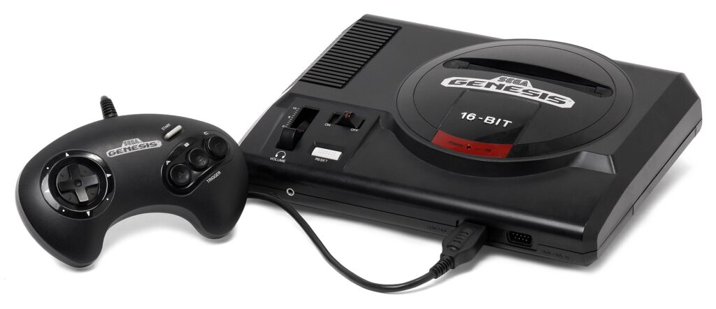
The original Sega Genesis, the machine Sonic was created to sell — the art book opens with the mascot search that produced him. Photo: Wikimedia Commons.
Inside the book: a design history, not a scrapbook
The finished volume is substantial by any measure: a hardcover of 248 pages, measuring roughly 310 by 275 millimetres, with a separate dust jacket, covering the years 1991 to 2016. Its contents mix design sketches, official illustrations, in-game sprites and pixel art, promotional material and box art, including material presented as previously unpublished. Crucially, it is not a picture dump. The editorial team — credited as Maarten Brands, Ruben Brands and writer Arjan Terpstra — built a written history around the pictures, explaining how Sonic originated and how his look changed, supported by accounts from four central Sonic Team figures: programmer and producer Yuji Naka, director Takashi Iizuka, art director Kazuyuki Hoshino and artist Yuji Uekawa.
Reviewers who worked through the whole volume consistently singled out the same strength: the opening stretch behaves like a proper oral history of a character being invented. Roughly the first 157 pages run from SEGA’s long, frustrating hunt for a mascot — Alex Kidd had never quite carried the fight to Nintendo — through the internal design competition that paired artist Naoto Ohshima with Naka, and on to the end of the Mega Drive era at Sonic 3 & Knuckles. Ohshima’s pencil studies get generous space, including explorations of the run cycle for a character who, in the games themselves, only needed a handful of movements. The thinking is preserved alongside the drawings: replaying levels was unavoidable in an era of limited saves, so the design turned repetition into a challenge of getting faster, while Naka’s love of racing and speed supplied the sensation the game was chasing.
The craft detail continues past the character. Enemy and stage design receive the same treatment, down to the functional logic of the golden rings — in the book’s telling, their placement quietly tells players they are heading the right way, quite apart from their better-known role as a collectable cushion against damage. One production flourish charmed almost everyone who reviewed it: selected 16-bit stages are printed in full, then overlaid with translucent pages carrying the hand-drawn designs for the same screens, so readers can compare intention and result by lifting a sheet. It is a gallery trick applied to level design, and it is the clearest example of the publishers thinking like curators rather than packagers.
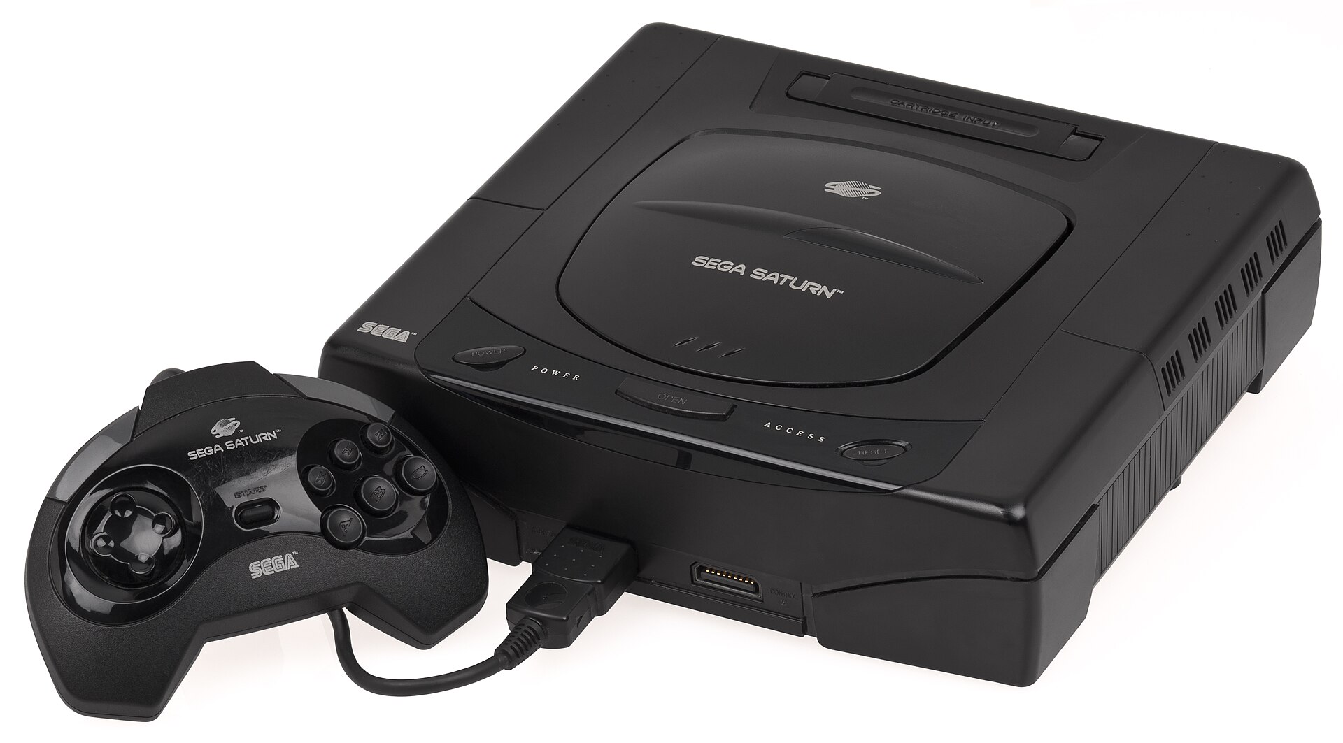
A Sega Saturn console — the book gives the awkward mid-1990s transition years, between the Mega Drive and Dreamcast eras, their own shorter passage. Photo: Wikimedia Commons.
Shorter chapters, bigger redesign
No honest history of Sonic can skip the difficult middle. The book gives the stretch from Sonic 3D Blast in 1996 through Sonic Jam in 1997 a comparatively brief passage — pages 158 to 165 in the pagination reviewers mapped out — before the story regains its stride with Sonic Adventure and the Dreamcast in the closing third, from page 167 onward. That structure mirrors the career: a mascot designed for side-on 2D speed had to be rebuilt for a camera that sat behind him, and the book treats those supposedly lost Saturn-era years as the apprenticeship that made the Dreamcast reinvention possible.
The redesign itself gets a satisfyingly practical explanation in these pages. The taller, leaner modern Sonic associated with Uekawa’s art was not simply a fashion update for a new generation. With a third-person camera following a very short, round character from behind and above, the old proportions hid too much of the scene — the head dominated and the limbs disappeared. Lengthening the character solved a visibility problem first and an image problem second. From there the narrative follows the cast and world expanding around the revised design, and closes in the Sonic Boom era, with the later chapters presenting Sonic as a character built to be redrawn for whatever hardware comes next.
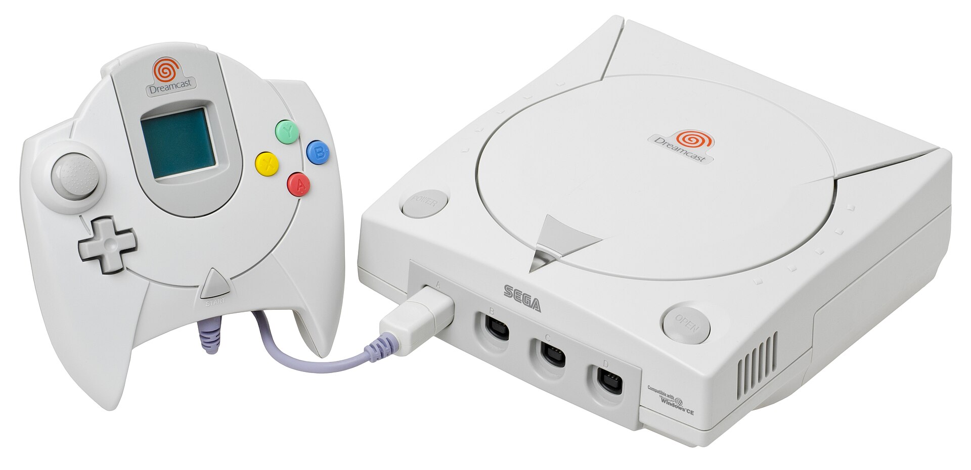
A Dreamcast console and controller — Sonic Adventure’s 3D reinvention, and Uekawa’s taller modern Sonic, anchor the book’s final third. Photo: Wikimedia Commons.
Two editions, one folding book stand
Both versions share the same book. The Standard Hardcover launched at $45 in the United States and €45 in Europe, while the Collector’s Edition — limited to 2,500 numbered copies — was priced at $120 or €120, with a ten percent pre-order discount offered to buyers who committed before February 2017. For the difference, collectors received the volume in a presentation outer box decorated with a modernised take on the classic Japanese Sonic 1 box art, an inner sleeve that folds out into a display stand for the book itself, and an exclusive Uekawa art print, hand-numbered — described in launch material as a newly drawn matted giclée, and in later book references as a twelve-colour screen print.
The stand deserves its sentence, because more than one reviewer treated it as the edition’s quiet masterstroke. A 248-page coffee-table book is an awkward thing to actually display; the sleeve turns the packaging into furniture, leaving the book propped open like an exhibit. It is exactly the sort of decision a print gallery makes and a conventional games publisher, at that time, generally did not. Even the book’s own design leans into its subject — its graphic styling deliberately echoes the level title cards of the 1990s games, so the object feels of its era rather than merely about it.
Rejected twice by its own publisher
For a book about quality control, the production history is almost too neat. Launch coverage through the winter of 2016 pointed to an April 2017 arrival, and the SEGAbits conversation in May still sat in that expectant window. The book then slipped to May because the finished printing failed to meet the publisher’s standards, slipped again into June when a second printing disappointed in the same way, and finally reached readers after Cook & Becker changed printers altogether. A cynical reading calls it a troubled launch. A fairer one notes that the delay is the brand: a gallery that rejected two full print runs of its flagship licensed book, at presumably real cost, was demonstrating precisely the fussiness its prices claimed to buy.
How it landed, and what it started
The reception justified the fuss. Kotaku’s reviewer admitted arriving sceptical that a Sonic volume could compete in a field dominated by lush modern blockbusters, and left calling it gorgeous — strong on familiar promotional art, stronger on sketches most readers had never seen, and elevated by the interview-driven history running through its first half. SUPERJUMP’s long review went further, praising the heavy paper stock and thick boards and calling it the most beautiful gaming coffee-table book its reviewer had handled, while recommending the standard edition on the reasonable grounds that the words and pictures — the part that matters — are identical in both. Specialist art-book reviewers reached a similar verdict from the standard edition, fingerprint anxiety on the glossy pages and all.

Sonic gameplay projected above a live orchestra at a Video Games Live performance — the wider cultural-celebration circuit the premium art book grew up alongside. Photo: Wikimedia Commons.
The afterlife confirmed the demand. By early 2019 the original printing was running low, and rather than simply reprint, Cook & Becker expanded it: the follow-up Sonic the Hedgehog Art & Design Book, released late that year, added 32 pages covering the three major releases since 2016 — Sonic Mania, Sonic Forces and Team Sonic Racing — bringing the total to around 280 pages at a $39.99 launch price. The Sonic template also became a series. The same year as the original book, the firm published The Art & Design of Final Fantasy XV, and in 2021 it gave Namco’s mascot the full treatment in PAC-MAN: Birth of an Icon, explicitly continuing the video game icons strand the Sonic volume had established.
Set in its moment, the book arrived just as a generation that had grown up with the Mega Drive acquired the income and the shelf space for objects like this, and as peers such as Bitmap Books were proving the same market from the independent side. Plenty of licensed game books existed before 2017, but they were usually strategy-guide spin-offs or thin making-of pamphlets bundled into collector’s boxes. The Sonic volume argued a different case: that a mascot’s concept sketches belonged in a numbered edition, that a level layout deserved a tracing-paper overlay, and that fans would pay gallery prices for gallery standards — and then reject two print runs to prove the standards were real. Every lavish franchise art book on a shelf today, and there are now very many, is living in the market that argument helped define.