When Nintendo announced the DS in 2004, the industry laughed politely. Two screens? A stylus? Against Sony’s PlayStation Portable — a widescreen powerhouse that played films — Nintendo’s odd little clamshell looked like a Game & Watch tribute act. A decade and 154 million units later, the verdict of history is total: the DS was not underpowered, it was differently powered. Its two screens and touch interface did not merely host games; they changed what games could assume about the player’s hands, eyes and attention, and this feature is about the design grammar that grew from them.
Start with the humblest revolution: the persistent second screen. Before the DS, strategy games paused for maps, RPGs paused for menus, racers hid their standings. The DS moved all of it into a permanent parallel channel. Advance Wars: Dual Strike put a live second front up top; Mario Kart DS showed every racer’s position and every incoming shell below; Castlevania parked its castle map where it belonged — always visible — and freed exploration from memorisation. Information design, the least glamorous and most consequential discipline in games, had a new default: one screen for the world, one for the truth about the world.

The stylus as a design material
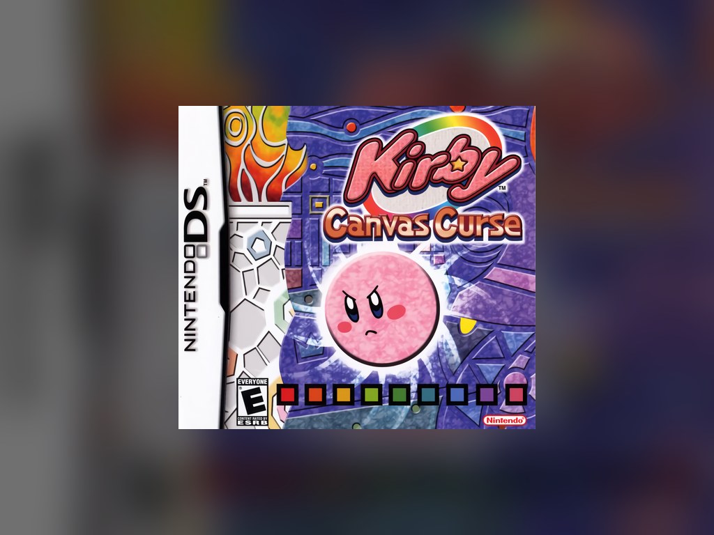
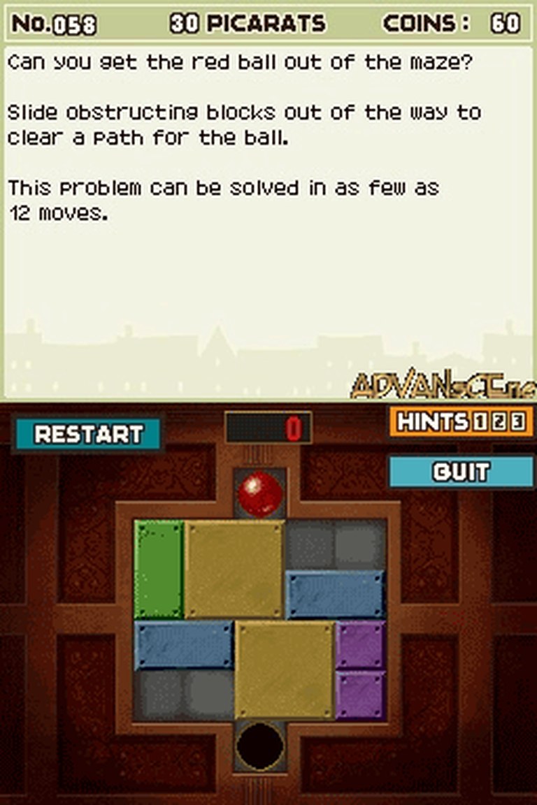
Touch changed the verbs. Drawing became a mechanic in itself: Kirby: Canvas Curse built a platformer out of drawn rails; Phantom Hourglass let you annotate the map in your own handwriting, turning note-taking — play that used to happen on paper beside the console — into a designed system the game could test. The Legend of Zelda’s boomerang flew along lines you sketched. Professor Layton’s puzzles were answered by circling, sliding and writing. Phoenix Wright’s DS case had you dusting fingerprints and blowing the powder off, a forensic ritual performed by your own breath through the microphone. Trauma Center made the stylus a scalpel and your steadiness a stat. Each of these is unthinkable with buttons alone.
Just as important was who the stylus invited in. A pen is the most universally understood tool on earth; people who had never held a controller could write, draw and tap. Nintendo’s Touch! Generations line — Brain Age’s arithmetic, Nintendogs’ petting, Cooking Guide’s instructions — was built directly on that literacy, and it expanded the audience for games by tens of millions. The design lesson travelled: within a few years, the iPhone made touch the default interface of computing, and the DS library stands as the proof-of-concept that touch gaming could be deep, precise and strange, not merely casual.
Two screens, one idea at a time
The boldest designers treated the pair of screens as one canvas with a hinge in it. The World Ends with You fought two different battles simultaneously, one per screen, and made synchronising them its theme. Hotel Dusk rotated the whole machine into a book and split its world between a map view and a first-person view, like a novel with a floor plan. Ghost Trick staged its ghost world and living world as parallel layers one tap apart. Even failures taught the grammar: games that stapled a pointless map below the action showed, by contrast, that the second screen worked only when it carried meaning — a lesson modern second-screen and HUD design still relearns.
The DS’s second screen was never about more pixels. It was about more meaning: a place for maps, notes, secrets and second fronts to live permanently beside the action.
There were costs, honestly counted. Touch controls could be imprecise for traditional genres — first-person shooters cramped hands for a decade’s worth of thumb-strap jokes — and the hinge gap broke vertical compositions that games like Sonic Rush turned into a feature only by embracing the seam. The microphone, the closing lid (used as an input by Hotel Dusk and Another Code in puzzles of genuine genius), the sleep mode that Pokémon turned into experience points: the DS kept proposing new physical vocabularies, and its best games are a catalogue of them.

The grammar outlived the machine
Trace the DS’s influence forward and it is everywhere. The Wii U’s GamePad, the Switch’s touchscreen, every phone game’s virtual buttons and drawn gestures, the map screens and notebook interfaces of modern RPGs, the very idea that a game can ask you to close it, blow on it or write in it — all of it was prototyped, at scale, on a clamshell with a resistive screen and a plastic pen. The 3DS kept the layout; phones took the interface to the world.
That is why the DS library repays study rather than mere nostalgia. Its classics are not simply good games that happen to be on the DS; they are answers to a design question no other machine asked so purely: what do you do with a second screen and a pen? Two decades on, the answers — drawn, tapped, annotated and fought across both displays — still look like the future arriving early.
There is a coda worth adding about preservation. The DS’s design grammar is also its preservation problem: emulators can split the screens across a monitor, and a mouse can impersonate a stylus, but the physicality — the pen’s pressure, the book grip, the lid that closes — resists translation, which is why original hardware remains the definitive way to experience this library and why the machines themselves have become collector staples. The games taught a generation that interfaces are ideas. Keeping the hardware alive keeps the ideas legible. Two screens and a stylus: a small machine’s complete re-imagining of what playing could mean, still unsurpassed in its coherence, and still — cartridge by cartridge — the most inventive library in handheld history.
What designers learned — and what they forgot
The DS’s lessons were absorbed unevenly by the industry that followed. The positive inheritance is easy to trace: asynchronous information displays became standard in everything from shooters’ HUD design to companion apps; note-taking and map-marking surfaced in games from Zelda’s own later entries (which kept the annotation faith on Wii U and Switch) to soulslikes’ player-message systems; and the entire casual-gaming explosion — the audience of millions who had never owned a console — was educated by Brain Age and Nintendogs into the customers who built the mobile games industry. The DS did not merely precede the smartphone era. It trained its users.
The forgetting is equally instructive. As screens converged into single slabs of glass, the particular virtues of the DS arrangement — a protected play screen and a tactile work screen, a hinge that made the machine its own stand and its own privacy shade, an input you could rest a hand on without occluding the action — were traded away for simplicity, and something genuinely useful went with them. Modern foldable phones keep rediscovering pieces of the formula, usually to reviews that note, correctly, that Nintendo did it in 2004. Design ideas this strong do not die. They wait, in a clamshell, for their next hinge.
If this feature has a practical conclusion, it is a shopping list disguised as a thesis: Canvas Curse for the drawn line, Phantom Hourglass for the annotated map, Trauma Center for the steady hand, Hotel Dusk for the closed lid, The World Ends with You for the two battles at once, Ghost Trick for the ghost world’s parallel stage. Play those six and you have played the DS’s design argument in full — six answers, in six genres, to the most productive question Nintendo ever asked its designers. The library holds dozens more. The stylus, as ever, is in your hand.